The recent global climate agreement in Paris had two clear messages that will affect how we travel.
First, nearly 200 nations agreed it's critical to limit global warming to a maximum of +2C. To do that there is only a challengingly small amount of climate pollution humanity can still emit – our 2C Carbon Budget. Even a very generous share of the global 2C Carbon Budget means Canadians and Americans will need to average around one tonne of CO2 per year over the next several decades from on all personal transportation. Currently we travel around 20,000 km per year. So a rough rule of thumb for 2C-compatible travel is to choose options that can take people 20,000 km or more per tonne of CO2 (tCO2).
Secondly, the nations of the world decided against creating any legally binding global rules or targets. Instead it was left to the collective voluntary actions of societies and individuals to do the right thing.
So in the spirit of the Paris climate agreement, I created an infographic that lets Canadians and Americans see how far different transportation options can take us on our 2C travel budget. It shows a large number of options to choose from, and allows quick comparisons between them. The ones that meet or exceed 20,000 km per tCO2 are shown in green.
I've been researching, charting and writing about travel emissions for many years. I read everything I can find on it, from technical data sheets to annual reports. I'm a data pack rat on this subject. And still, this infographic took me nearly a month to research, organize and create. My goal has been to provide people with something I've not seen before: a single graphic that allows travellers to easily and accurately compare the climate impacts from common transportation options. Hopefully you will find it informative and useful.
Choosing 2C Travel -- Infographic
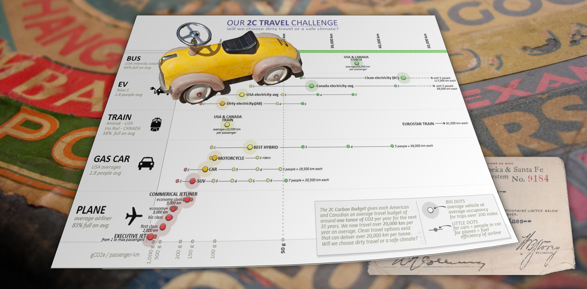
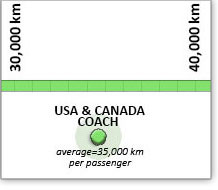
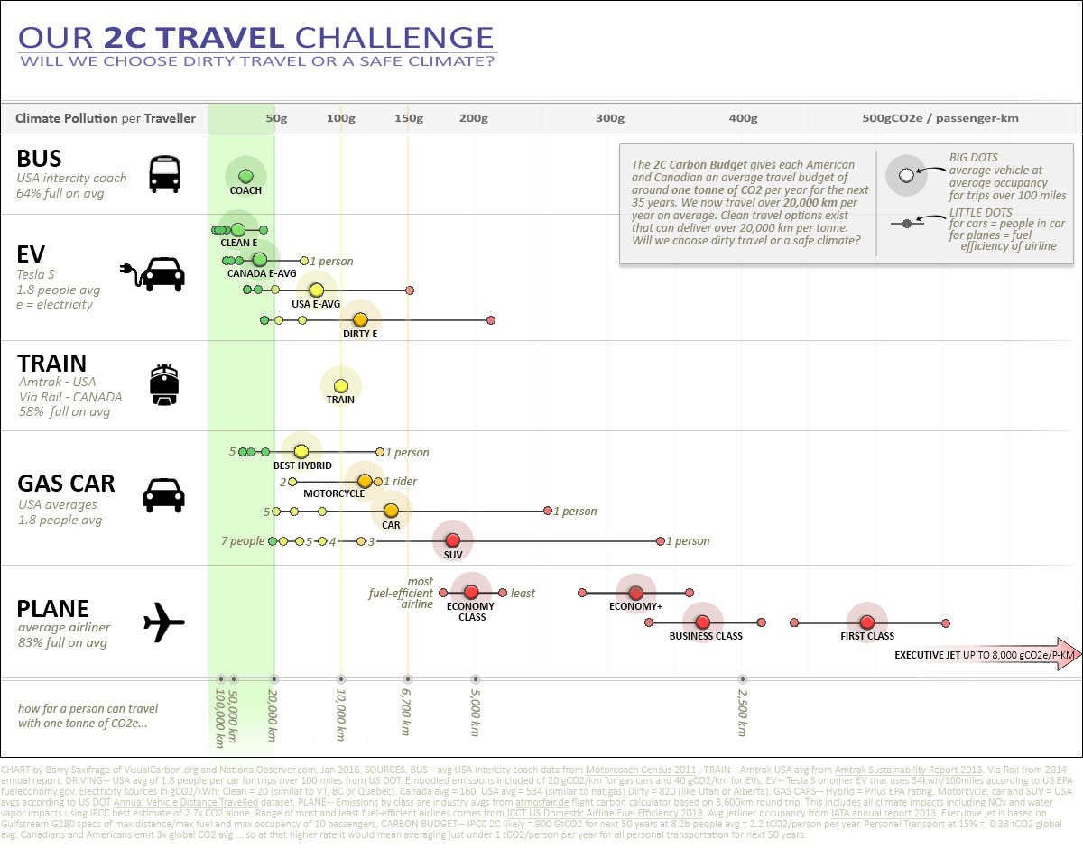
Here, then, is the full infographic. Click it for a full size version suitable for printing, sharing or shredding … depending on how you feel about our 2C travel challenge. The big dots show average occupancy. The little dots for cars show different occupancy options. Green colour marks options that meet or exceed our 2C travel challenge of 20,000 km per tonne of climate pollution. A detailed explanation follows.

CHART NOTES: This infographic shows how many kilometers a passenger can travel on one tonne of climate pollution (tCO2e). The kilometer number line runs across the top. Each row shows a different travel mode. The biggest dots on the chart show the current USA and Canada averages. The little dots show choices available to passengers, if any, to alter the climate pollution per passenger-km. Those that prefer the more traditional metric of gCO2e/passenger-km can see this listed at the bottom of the chart. Key data sources are listed in the graphic. Chart by Barry Saxifrage of VisualCarbon.org and NationalObserver.com.
Here are the main takeaways:
- Intercity buses, like Greyhound, take passengers an impressive 35,000 km per tonne. The hound has become my primary mode of long-distance travel because it is three times less climate damaging than trains, and seven times cleaner than the best of what airlines offer.
- Amtrak and Via Rail take passengers 10,000 km per tCO2. This is twice as clean as the least-dirty flying option, but still not that great. Compare our North American trains to Europe's electric Eurostar trains that take passengers eight times farther per tonne of climate pollution. Sure would be sweet to have an option like that over here.
- Flying sadly has no climate safe options. The very best a passenger can do is to choose an economy class seat on the most efficient airline and they will still only manage ~5,700 km per tonne of climate pollution. Choosing a first class seat is more than twice as climate polluting, delivering only 2,000 km per tonne. Executive jets are worse yet.
The airline industry has a dirty secret: they significantly under-report their climate impact by only counting their CO2 in their carbon calculators and reports. But the best science shows CO2 is less than half of their overall climate impact; water vapour, soot and other chemical emissions have large impacts too. The industry now promises to include the non-CO2 "multiplier methodology in due course" ... but until they do, their CO2-only stats are misleading when used to compare against other travel modes. My infographic corrects their under-reporting bias by showing the full climate impact according to a top-ranked independent flight calculator that follows the best climate science (Atmosfair).
It is technically possible to offer flights with dramatically lower climate impacts via a combination of bio-fuels, lower and slower, all economy seating, direct routes, etc. The fact that airlines don't offer such flights that could be compatible with a personal 2C carbon budget, caused me to reluctantly give up flying many years ago. I wish they would. - Burning to drive. Cars that burn gasoline provide a huge range of options from as dirty as flying to cleaner than the bus. As the graphic shows, choosing an efficient car and filling the seats is the key to 2C travel.
- Plug and go. Electric cars have the greatest range of possible kilometers per tonne. A single person with dirty electricity can be as dirty as flying. On the flip side, using electricity as clean as BC's and filling the seats will take passengers over 110,000 km per tonne! And yes, that includes the emissions embodied in building the car.
Here's a condensed chart that clearly illustrates the full range for each travel mode in Canada and USA today. The top row shows what jets, trains and buses deliver. The second row shows the wide range of pollution potential from fossil fuel burning cars — from dirty as some jets to cleaner than taking the bus. The bottom row shows the amazingly wide range of possibilities from electric cars.

The world is now faced with a 2C carbon budget that is challengingly small and shrinking rapidly as we collectively drag our feet in cutting back on our climate pollution. The Paris agreement left it up to each society to voluntarily do the right thing. Will we choose dirty travel or a safe climate? No one is going to force us either way. As my infographic shows, there are plenty of choices available for either path.
"Around 10 % of the global population account for 80 % of total motorized passenger-kilometres (p-km) with much of the world’s population hardly travelling at all."-- IPCC Fifth Assessment report
The details
For those interested in more a detailed discussion of each travel mode, the rest of this article builds the graphic step-by-step with in-depth explanations. At the very bottom of this article is a second version of this infographic that focuses on emissions per kilometer. Same data, different focus.
I'll start with details on the three most common public transportation options: buses, trains and jetliners.
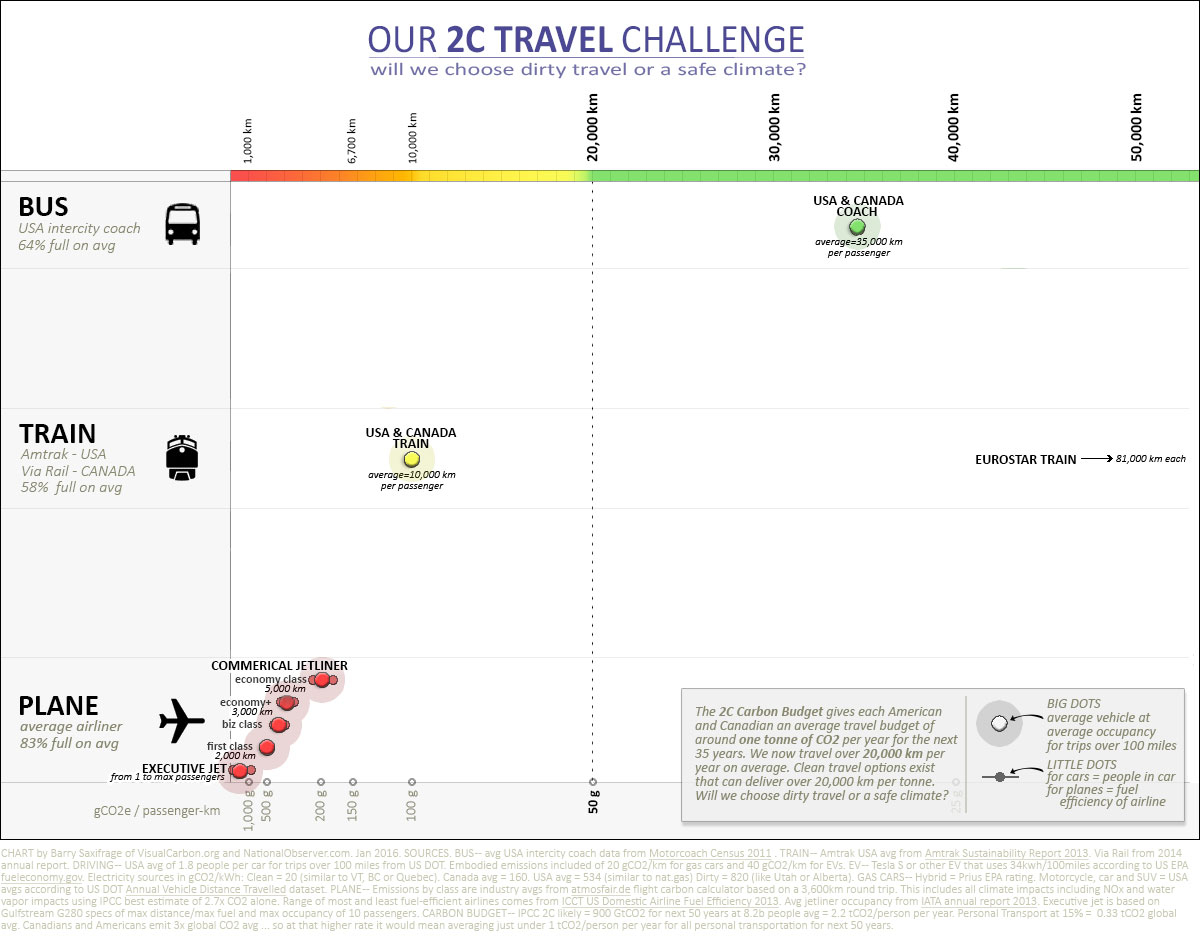
By Bus
The top row shows that passengers travelling on intercity buses in Canada and USA average an impressive 35,000 km per tonne. There are over 800 companies that operate daily intercity coach service in the United States. On Greyhound alone, eighteen million passengers travelled over 8 billion kilometers last year across Canada and USA.
My partner, Carrie, and I often choose the bus, even for multi-day trips across Canada and in the USA. In her recent book, Carrie describes the pleasure of travelling by bus in Mexico, where bus companies target comfort-loving travellers. Buses are just so amazingly easy on our climate. In fact, I did most of the Photoshop assembly of this infographic on a recent four-day Greyhound trip.
By Train
Passengers on both Canada's Via Rail and America's Amtrak average around 10,000 km per tonne. As the infographic shows, this is 2.5 times more climate polluting than riding a bus. I have to admit I found this climate factoid discouraging because I do enjoy train travel. But with such a gigantic climate pollution advantage I mostly, but not always, choose the bus over the train now.

However, there are trains that are amazing climate champions. To provide an example from elsewhere in the world I included the famous Eurostar train on my infographic. Well, actually I had to just add an arrow for it that points way off the chart. That's because passengers on the Eurostar average over 80,000 km per tonne. We will see more about the climate benefits of combining super-low-carbon electricity and modern technology when we discuss electric cars below. As our required carbon restrictions grow tighter thru the years I think we are going to be very frustrated here in North America to find ourselves without any such super-low-carbon, modern trains to fall back on.
By Jetliner
"Attitudes towards flying say a lot about someone’s view on global warming … On an individual level, those who travel by air leave gigantic carbon footprints " -- Editorial in Nature
Passengers flying economy class average around 5,000 km per tonne of climate pollution. That is seven times as climate polluting as by bus, and twice as dirty as North American train travel.

Choosing first class more than doubles your climate pollution. The industry's own carbon calculator automatically doubles the CO2 for any class above economy. The International Panel on Climate Change's Greenhouse Gas (IPCC GHG) guidance data lists first class as four times more climate polluting than economy on long-haul flights. And a detailed study by the World Bank of their own carbon footprint found their actual first class travel was nine times more climate polluting than economy. Yeah, nine times. The World Bank responded with "virtual elimination of first class travel" plus reductions in other premium class travel. This led to large emissions reductions without reducing passenger km travelled.
As the infographic shows, flying in first class is so climate polluting that it blows out a person's annual 2C travel budget in less than three hours. Riding in first class is very nice. Then again, so is a safe and sane climate. Which will we leave as our legacy? The aviation industry could dramatically cut their emissions by switching to economy class only seating.
Executive jets appear to be significantly more climate polluting than first class. The climate impact of executive jet travel seems to be one of those "wink wink nudge nudge, say no more, say no more" exemptions from climate reporting. Even the IPCC's GHG guidance data is silent. Unable to find climate emissions data on this increasingly popular travel mode I did my own calculations to provide one example: the Gulfstream G280. I used the manufacture's max fuel, occupancy and cruising range specs. As my infographic shows the result ranged per passenger from 120 km to 1,200 km per tonne depending on occupancy. The best of these numbers is still 30 times more climate polluting than taking the bus. The worst is 300 times more climate polluting.
Here are three options for those people looking to reduce their climate pollution from jet travel:
- CHOOSE A CLEANER OPTION -- This is the option my partner and I have gone with for several years now. Unable to find any airline offering low-carbon options (such as bio-fuel flights), or any airlines setting and meeting the basic criteria for a 2C world (total emissions declining), we've skipped jet travel all together, spending our money on companies that provide climate safer travel. Only five per cent of the world's population has ever flown, so we are in good company. And we are doing what the climate science says needs to be done: "shorter journeys (hence by road instead of by air), thereby reducing tourism total travel, has become more important." -- IPCC's Fifth Assessment report
- ECONOMY CLASS -- For those that do fly, the data overwhelmingly shows that choosing to sit in economy class significantly reduces the climate damage compared to premium classes.
- EFFICIENT AIRLINES -- An annual study of US airlines shows that the best are 10 per cent less climate polluting than average, while the worst are 10 per cent more. Choosing the cleanest airline can help a bit. My graphic shows this range in airline efficiency as small dots on either side of the big "average" dot.
In the USA today, carbon emissions from jets equal four per cent of the nation's CO2. That rises to ten per cent of all US greenhouse gases when the other climate impacts of jet emissions are included. That's more than from all of California, the world's seventh largest economy. And to top it all off, the climate pollution from jets is currently completely unregulated. No limits. No pollution fees. The voluntary-only strategy for staying below 2C certainly isn't working for jet pollution…yet anyway. Will we continue to prioritize dirty travel over a safe climate? Which will we choose as our climate legacy?
By fossil-fuel burning Car
Next, let's dig into the climate impacts from driving fossil-fuelled cars.
As you can see, driving spans a huge range from dirty as flying, to same as the train, to cleaner than taking the bus. The two critical factors that determine how clean or dirty driving is are fuel-efficiency and number of passengers.
In my infographic above, the big dots show the average car occupancy in the US for trips over 100 miles (1.8 people). The little dots show other possible occupancy levels. Here are some specific examples:
- BEST HYBRID -- Passengers in a Toyota Prius can exceed bus travel with an impressive 39,000 passenger-km per tCO2. That's like driving around the planet at the equator for just one tonne of CO2. But that is only true if all five seats are occupied. Take the same car with just one person and it dishes out only 8,000 passenger-km per tCO2. That is dirtier than train travel…and even dirtier than an average SUV with three people in it. Occupancy matters for low-carbon travel.
- AVERAGE CAR OR SUV -- Both of these options can be as dirty per person as flying. And both can be many times cleaner than flying. As the graphic makes clear, it depends on how many seats are filled for the journey.
I often read blanket statements like "flying is cleaner than driving" or "driving is better for the climate than flying". These statements are so simplistic they are meaningless. The reality is that it depends on what you drive and how many people you take with you. Flying is always a climate dirty choice. Driving can be super dirty too. Or driving can be pretty darn clean. You have a wide range of choices with driving that you don't have with flying. People aiming for 2C compatible travel have options available to them with gasoline-burning cars.
By Electric Car
Finally, let's add in electric cars.

The range of emissions possibilities from EVs is absolutely massive. A person can travel in an EV anywhere from under 5,000 km to over 110,000 km per tCO2! And that includes the embodied emissions from building the EV, which are double those of an average gasoline car.
The two most critical climate factors for EVs are how clean the electricity is and how many people are in the car. Here are a few examples to highlight the range of possibilities:
- WITH DIRTY ELECTRICITY -- EVs in regions that rely primarily on coal-fired power, like Alberta and Utah, have emissions similar to an average car. Like an average car, one person in an EV powered by dirty electricity can be as dirty as flying. However, even with dirty electricity, if you fill the seats then it becomes much cleaner than either flying or the train.
- WITH USA AVERAGE ELECTRICITY -- EVs get cleaner as the electricity grid gets cleaner. So at the USA average, it only takes two people in an EV to be cleaner than the train. And filling the seats rivals the bus.
- WITH CANADA AVERAGE ELECTRICITY -- At this level, EVs are much cleaner than the best gasoline hybrid. With just one person, an EV is cleaner than taking the train. With three people it is cleaner than taking the bus. Full seats get nearly 70,000 passenger-km per tonne. No fossil-fuel burning vehicle comes close.
- WITH CLEAN ELECTRICITY -- EVs really shine in regions with mostly renewable electricity, like BC, Manitoba, Quebec and Vermont. Put two people in one and each passenger averages over 40,000 km/tCO2. Fill the seats and passengers exceed 110,000 km/tCO2. If you just count the electricity emissions, a fully occupied EV in these regions delivers over one million passenger-kilometers per tonne of CO2. For scale, that is much farther than to the moon and back.

Another real benefit of EVs is that they use far less energy. To drive an equivalent gasoline car you have to put in three times the energy. Most of the energy released from burning gasoline escapes as waste heat.
The US EPA says just 19 per cent of the energy in gasoline makes it to the wheels, vs 60 per cent of electrical energy for EVs. That means the majority of the CO2 we are dumping out our tailpipes comes from burning fuel that does no work for us. We are literally ruining our climate and acidifying our oceans to produce heat that we don't want and can't use.
Clear and present choices
US Secretary of State John Kerry called climate change a "clear and present danger". Those who want to reduce their role in the crisis have clear and present choices available to them.
Additional Infographic #1: Emissions per kilometer
Here is an alternate version of the main infographic in this article. It uses the same information but is organized to show the amount of climate pollution per kilometer. This is the mathematical inverse of the main infographic. On the main infographic, the farther you move to the right on the chart the lower the amount of climate pollution. In this chart the opposite is true. Here the climate pollution increases as you move to the right. So in this chart the closer a dot is to the left edge, the cleaner it is. In both versions, the green zone shows options that meet or exceed our 2C travel challenge of moving people 20,000 km per tonne of CO2. Click to view full size.

Additional Infographic #2: Lifecycle emissions for gasoline vs electric cars.
I'm also including one of the most popular graphics I've published over the years on this subject. It compares the total climate pollution over the entire lifespan of different cars. It includes gasoline cars, plug-in hybrid and all-electric vehicles. And it shows a range of typical electricity sources. This chart includes both the emissions from building the vehicle, and from fueling it. The plus side of a chart like this is that it shows a broader range of vehicles and it lets you see the full climate pollution commitment that comes with each new car. At the same time, it also lacks the ability to easily see how choosing different occupancy levels can dramatically change the emissions per person. So this kind of chart is harder to use if you want to compare driving to different transportation options like jetliners, trains and buses. If you want more details about this particular infographic you can read my article on it.

The fine print
Finally, here are the very fine print details that are printed at the bottom of the main infographic in this article. On some screens this small print in the graphic can be hard to read. So here it is for those fellow data geeks out there.
CHART by Barry Saxifrage of VisualCarbon.org and NationalObserver.com. Jan 2016. SOURCES. BUS -- avg USA intercity coach data from Motorcoach Census 2011 . TRAIN -- Amtrak USA avg from Amtrak Sustainability Report 2013. Via Rail from 2014 annual report. DRIVING -- USA avg of 1.8 people per car for trips over 100 miles from US DOT. Embodied emissions included of 20 gCO2/km for gas cars and 40 gCO2/km for EVs. EV -- Tesla S or other EV that uses 34kwh/100miles according to US EPA fueleconomy.gov. Electricity sources in gCO2/kWh: Clean = 20 (similar to VT, BC or Quebec). Canada avg = 160. USA avg = 534 (similar to nat.gas) Dirty = 820 (like Utah or Alberta). GAS CARS -- Hybrid = Prius EPA rating. Motorcycle, car and SUV = USA avgs according to US DOT Annual Vehicle Distance Travelled dataset. PLANE -- Emissions by class are industry avgs from atmosfair.de flight carbon calculator based on a 3,600km round trip. This includes all climate impacts including NOx and water vapor impacts using IPCC best estimate of 2.7x CO2 alone. Range of most and least fuel-efficient airlines comes from ICCT US Domestic Airline Fuel Efficiency 2013. Avg jetliner occupancy from IATA annual report 2013. Executive jet is based on Gulfstream G280 specs of max distance/max fuel and max occupancy of 10 passengers. CARBON BUDGET -- IPCC 2C likely = 900 GtCO2 for next 50 years at 8.2b people avg = 2.2 tCO2/person per year. Personal Transport at 15% = 0.33 tCO2 global avg. Canadians and Americans emit 3x global CO2 avg ... so at that higher rate it would mean averaging just under 1 tCO2/person per year for all personal transportation for next 50 years.

- Barry Saxifrage
- Climate Analyst
- @bsaxifrage
Keep reading
Excellent article, well done,
Excellent article, well done, saw it for the first time today. Thanks Barry
Comments